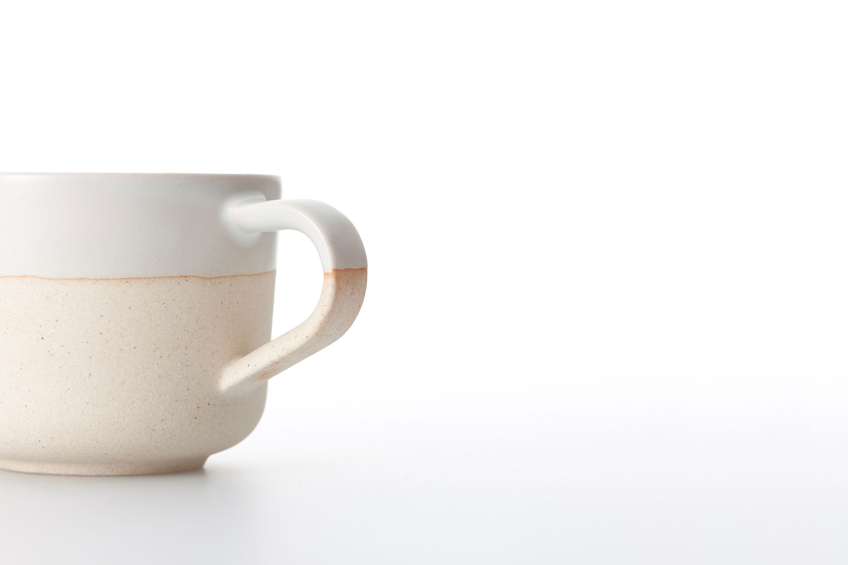
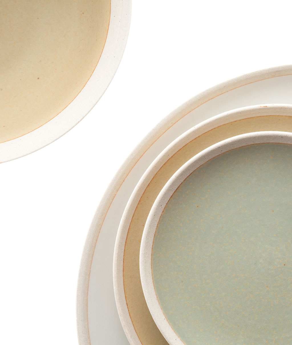
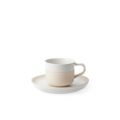
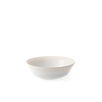
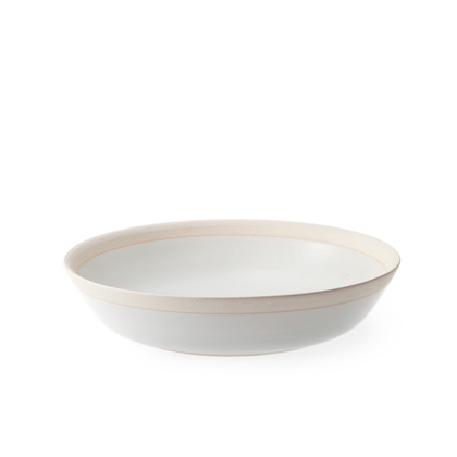
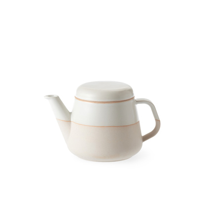
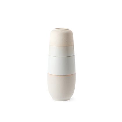
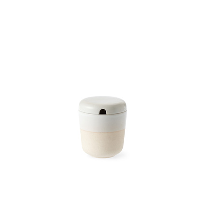
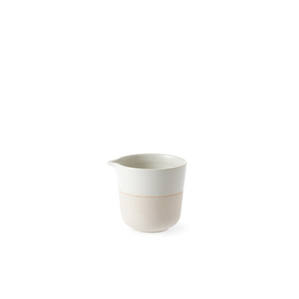
The "flame color" (hiiro) along the border between the glaze and the clay is a natural phenomenon created during the firing process: it results from the interaction between earth, air and fire.
Typically, the glaze is applied over all visible surfaces of the pottery, hiding the flame color on the underside of the pot. By stopping the glaze along a visible line on the pottery, we can use this beautiful color as a motif.
Using white clay and white glaze enhances the vivid beauty of the red flame color, evoking the horizon line at dawn, separating the earth and sky.
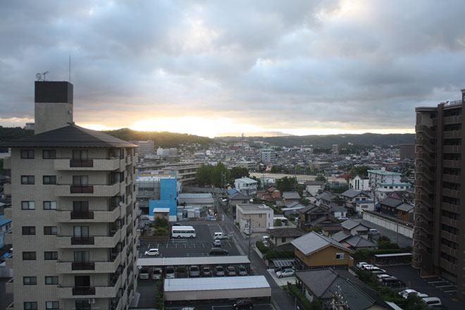
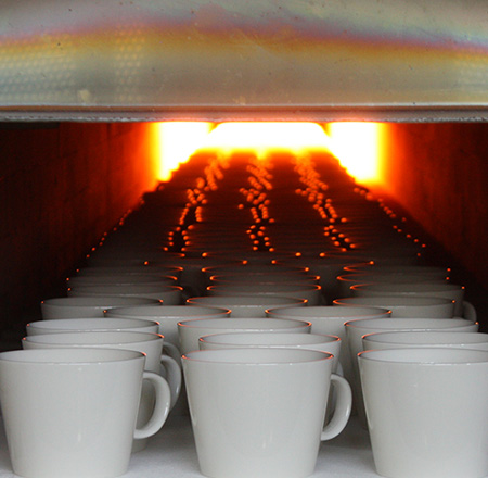
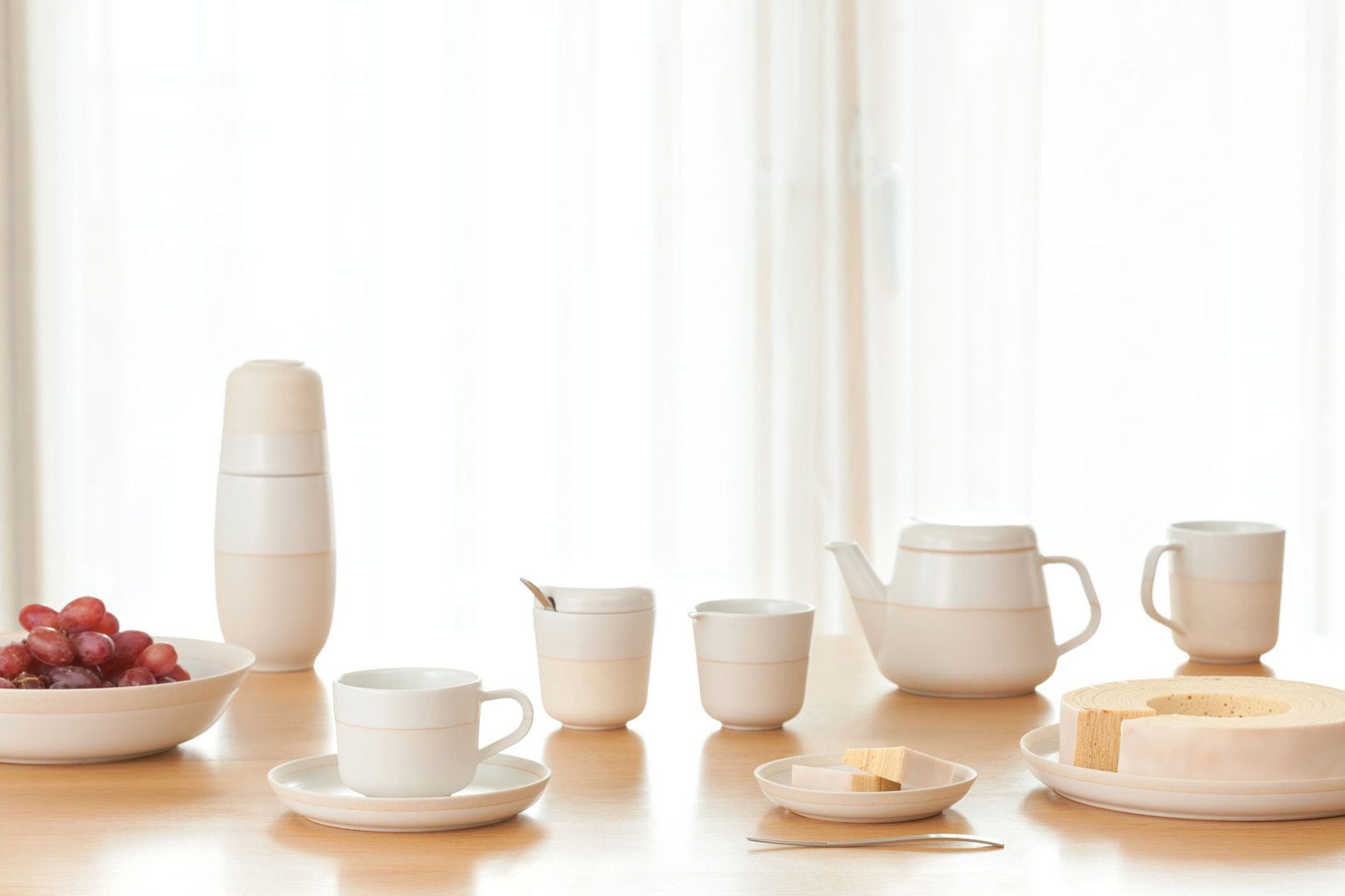
The ample consistency of the clay and the matte glaze used to make hiiro are faithful to the texture of Japanese pottery.
hiiro's three color varieties remind one of Japan's beloved seasons: the different colors of the glazes conjure up snow, sky and the autumn leaves of the Japanese silver apricot tree.
hiiro will add to your pleasurable moments, set among Japanese artisan pieces that evoke nature.
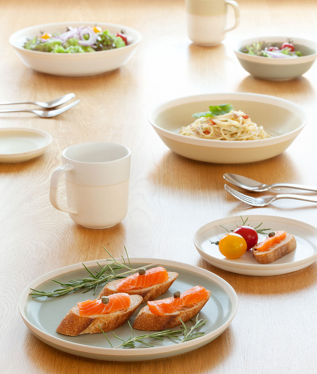
Use the dishes for pastas and curries. Use the bowls for salads and soups.
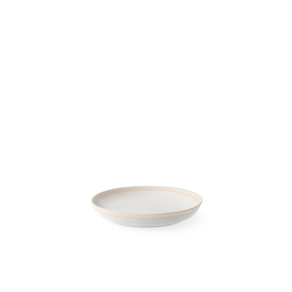
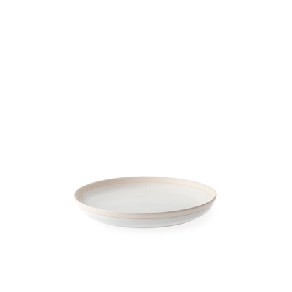
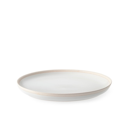
Use the large plates to present your dishes and the small plates for serving. With various applications, the diverse sizes and shapes of the hiiro series will enliven your table decor.
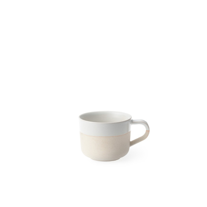
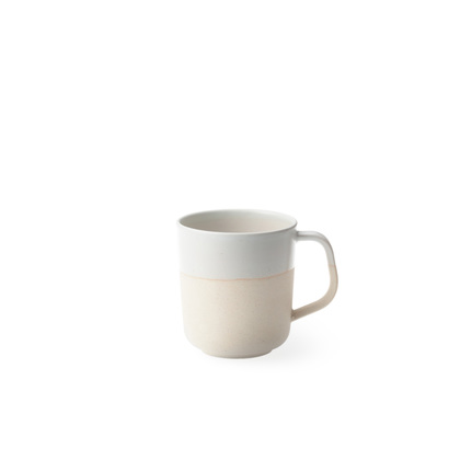
The handles of the cups are also partially unglazed, allowing you to enjoy the different textures both with your fingers as well as your eyes.
Beginning with the meeting of earth, air and fire, hiiro will accompany you as you create your stories within your daily living space.


DESIGNER
Kaichiro Yamada KAICHI DESIGN
After graduating from Musashino Art University in 1997, he remained at the university as a research associate until taking the helm at KAICHI DESIGN in 2004.
His work is focused on allowing everyone involved to be able to live vibrantly thanks to designs from thinkers, creators, promoters, and users.
Major works include branding for DENSHIRO, HIKIYOSE, LIVING TALK and ISUTOKU, product design for KOTORI (h concept) and SYUKI-DARUMA (sghr), and interior design for EDITORY.
Accolades include: Good Design Award (2004, ’11, ’13, ’14, ’16), Red Dot Design Award (2010), Design for Asia Award (Hong Kong, 2012), award for excellence at Tokyo Business Design Award 2013.
Past exhibits include: A Dream Come True (Milan, 2007), Product Design Today: Creating “Made in Japan” (The National Museum of Modern Art), among numerous others.

